

Color Blindness & Vision
Understanding how color vision affects accessibility
1. Types of Color Vision
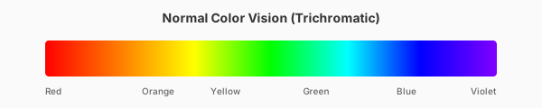
Color blindness affects approximately 8% of men and 0.5% of women worldwide. Most people with color blindness aren't completely colorblind—they see colors differently. The three main types relate to which cone cells in the eye are affected.
2. Protanopia (Red-Blind)
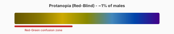
Affects ~1% of males. Red appears darker and can be confused with brown, green, or black. Red-green distinctions are very difficult. Traffic lights may appear as different shades of yellow.
3. Deuteranopia (Green-Blind)
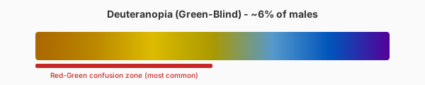
The most common type, affecting ~6% of males. Green and red look similar, often appearing yellowish-brown. This is the most important type to design for due to its prevalence.
4. Tritanopia (Blue-Blind)
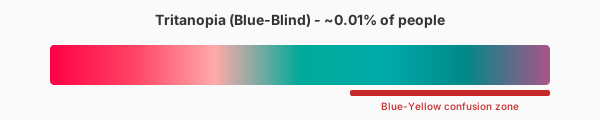
Rare, affecting ~0.01% of people. Blue appears greenish, and yellow appears pink or gray. Blue-yellow distinctions are difficult. This type is often acquired rather than inherited.
5. Designing for Color Blindness
Good contrast helps everyone. Use icons, patterns, or labels alongside color. Avoid problematic combinations like red/green and blue/yellow. Test with simulation tools to verify accessibility.
Ready to Check Your Colors?
Use our contrast checker to test your color combinations against WCAG guidelines, simulate color blindness, and get accessible alternatives.
Open Contrast Checker