

Combinations to Avoid
Common color mistakes and how to fix them
1. Red-Green Combinations
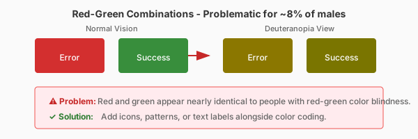
Red and green are the most problematic color pair, affecting ~7% of men. Common examples include error/success states, Christmas themes, and traffic-light-style indicators. Use blue instead of green, or add icons.
2. Blue-Yellow Combinations
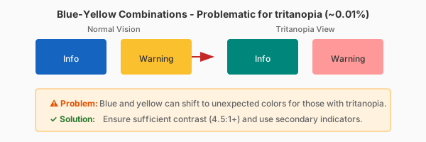
Blue and yellow are problematic for tritanopia. Yellow can appear pink or gray, while blue looks greenish. Avoid using these as the only distinction between elements. Add patterns or shapes.
3. Low Contrast Combinations
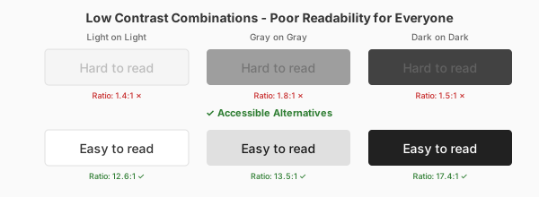
Light text on light backgrounds (like light gray on white) and dark text on dark backgrounds fail for everyone. Gray-on-gray is particularly problematic. Always test with our contrast checker.
4. Safe Universal Combinations
Black on white (or white on black) works for everyone. Blue on white, purple on white, and orange on dark backgrounds are generally safe. Always pair color with secondary cues like icons, underlines, or patterns.
Ready to Check Your Colors?
Use our contrast checker to test your color combinations against WCAG guidelines, simulate color blindness, and get accessible alternatives.
Open Contrast Checker