

Color Harmony Masterclass
Understand every harmony mode and color setting to create exactly the palette you want
What Is Color Harmony?
Color harmony describes combinations of colors that look pleasing and balanced together. It is based on relationships between colors on the color wheel — a circular arrangement where similar hues sit next to each other and contrasting hues sit across from each other.
Some combinations feel calm and unified, while others feel energetic and bold. Spectra uses these principles to automatically generate color palettes from a single starting color, so you do not need to be a color theory expert to get beautiful results.
The 9 Harmony Modes Explained
Each harmony mode generates colors using a different relationship on the color wheel.
Auto picks a random preset palette — great for quick exploration and happy accidents. Complementary selects the color directly opposite yours (180 degrees apart), creating bold, high-contrast pairs. Analogous uses neighboring colors (within 30 degrees), producing calm, cohesive palettes.
Triadic spaces three colors evenly around the wheel (120 degrees), giving vibrant but balanced results. Split-Complementary is a softer alternative to Complementary — it uses the two colors adjacent to your complement. Tetradic arranges four colors in a square (90 degrees), offering rich, complex palettes.
Monochromatic stays within a single hue but varies lightness and saturation, perfect for elegant, minimal designs. Double-Complementary uses two neighboring colors plus both their complements for sophisticated four-color schemes. Clash intentionally creates tension with a 90-degree offset, producing edgy, unconventional palettes. Pentadic distributes five colors evenly (72 degrees apart), creating rainbow-like variety.
The Seed Color: Your Starting Point
The seed color is the foundation of your entire palette. Every other color in the harmony is calculated relative to it, so choosing the right starting color matters.
Warm seed colors like reds, oranges, and yellows produce energetic, inviting palettes. Cool seed colors like blues, greens, and purples create calmer, more professional results. Neutral seed colors like grays and muted tones lead to sophisticated, understated palettes.
For the most versatile results, start with a mid-saturation color rather than a fully vivid or very muted one. This gives the harmony mode room to create both lighter and darker variations within the palette.
Grayscale Mode and When to Use It
The Grayscale toggle strips all color information from the generated image, producing compositions in pure black, white, and shades of gray.
This is useful for backgrounds that need to work with any foreground color — a grayscale texture will never clash with your content. It is also ideal for creating print-friendly outputs that look consistent whether printed in color or black and white.
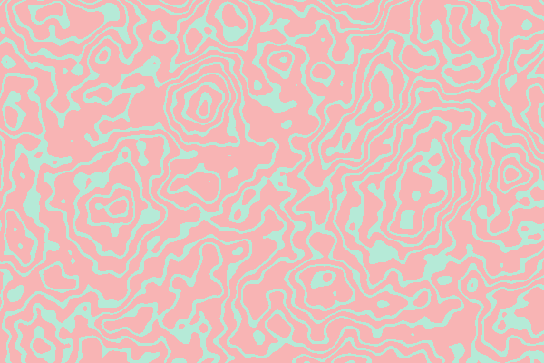
Grayscale mode pairs especially well with detailed styles like Stippling, Topographic, or Halftone, where the focus shifts from color to form and texture.

Combining Blur with Color for Mood
The blur slider is a powerful mood-setting tool that transforms any style from detailed and technical to soft and dreamlike.
At zero blur, you see every detail of the generated pattern — ideal for geometric precision or when the pattern itself is the focal point. Low blur (1-3) gently softens edges, creating backgrounds that feel polished without losing their character.
Higher blur values (5-10) produce abstract, painterly gradients that work beautifully as slide backgrounds or behind text. The best combinations for a dreamy mood: Gradient Mesh or Plasma with Analogous harmony and blur set to 6-8. For a focused, energetic feel: Voronoi or Geometric Shapes with Triadic harmony and no blur.