

Lorem Ipsum for Figma
Generate placeholder text perfectly sized for your Figma designs.
Opens generator with design-friendly settings
Figma Component Anatomy
Different Figma components work best with different Lorem Ipsum outputs:
| Component | Output Type | Recommended |
|---|---|---|
| Button | Words | 1-3 words |
| Card | Sentences | 2-3 sentences |
| Hero Section | Paragraphs | 1 paragraph |
| Navigation | Words | 1-2 words each |
Common Figma Use Cases
Component Libraries
Fill buttons, cards, and modals with placeholder text.
High-Fidelity Mockups
Create realistic screens for client presentations.
Prototyping
Build interactive flows with realistic text content.
Design Systems
Document typography with example text at various sizes.
Step-by-Step Walkthrough
Follow these steps to add Lorem Ipsum to your Figma designs:
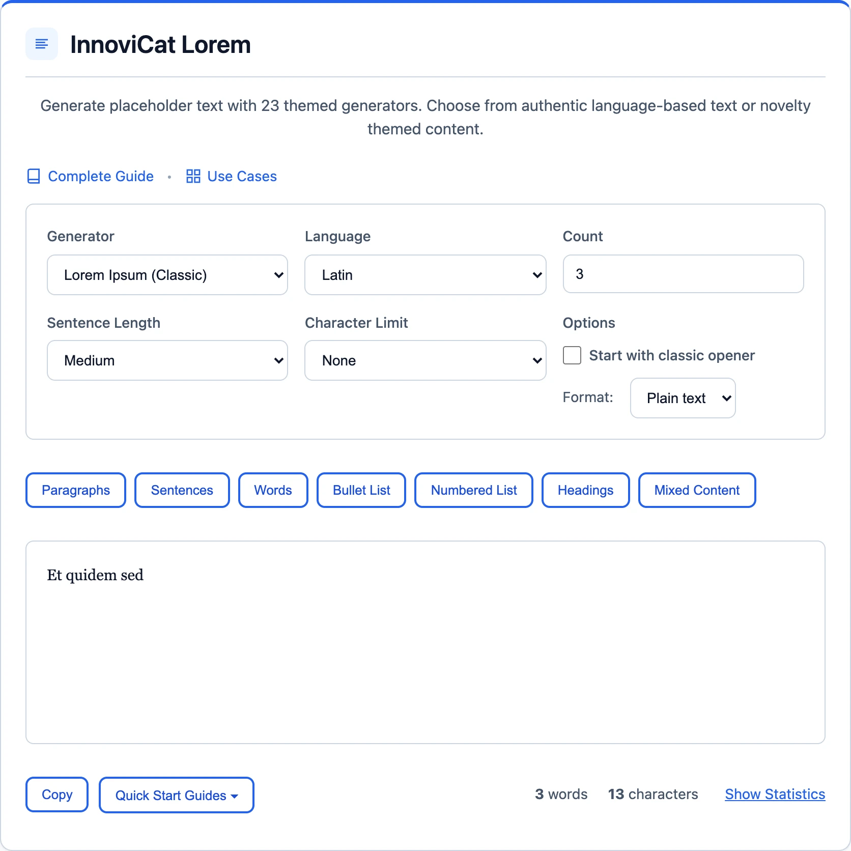
1 Generate Text Here
Use our generator to create exactly the text length you need.

Generator Settings
| Output Type: | Words / Sentences |
2 Copy the Text
Click the Copy button to copy the generated text.
✓ Paste in Figma
Select a text layer and paste (Cmd/Ctrl + V).
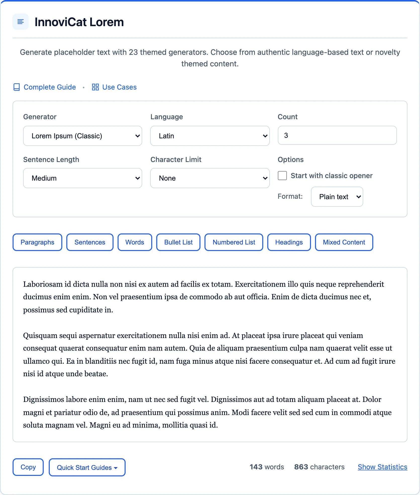
Ready-to-Paste Figma Text
Copy these samples directly into your Figma files:
Button Label
Card Description
Lorem ipsum dolor sit amet, consectetur adipiscing elit. Sed do eiusmod tempor incididunt ut labore.
Hero Text
Lorem ipsum dolor sit amet, consectetur adipiscing elit. Sed do eiusmod tempor incididunt ut labore et dolore magna aliqua. Ut enim ad minim veniam, quis nostrud exercitation.
Tips for Figma Designers
- Use text styles: Apply your text styles to Lorem Ipsum to test typography at scale.
- Test auto-layout: See how your layouts respond to different text lengths.
- Try different generators: Use themed generators like Hipster or Corporate for creative projects.
- Match final content length: Estimate real content length for more accurate mockups.
Frequently Asked Questions
Does Figma have built-in Lorem Ipsum?
Figma offers Lorem Ipsum through community plugins rather than a built-in feature, while our tool offers 26 generators, character limits, and more output options.
What's the best text length for UI components?
It varies: buttons need 1-3 words, card descriptions 15-30 words, and hero sections 20-50 words. Our tool lets you control this precisely.
Can I generate text that matches my brand voice?
Try our themed generators! Corporate Ipsum for business, Hipster for lifestyle brands, or Startup for tech companies.