

Lorem Ipsum for UI Mockups
Generate placeholder text sized for common UI components.
Opens generator with UI-optimized settings
Common UI Components
Buttons & CTAs
Short action text: 2-4 words
Card Descriptions
Preview text: 15-30 words
Modal Content
Detailed info: 30-80 words
Tooltips & Help
Brief hints: 5-15 words
Step-by-Step Walk-through
Generate text for UI mockups in three easy steps:
1 Choose Component Type
Decide what UI element you need text for (buttons, cards, modals, etc.).
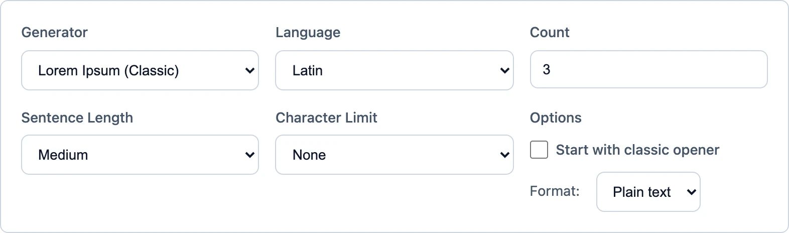
Generator Settings
| Output Type: | Words / Sentences |
2 Set Word Count
Use Words output with precise count for your component size.
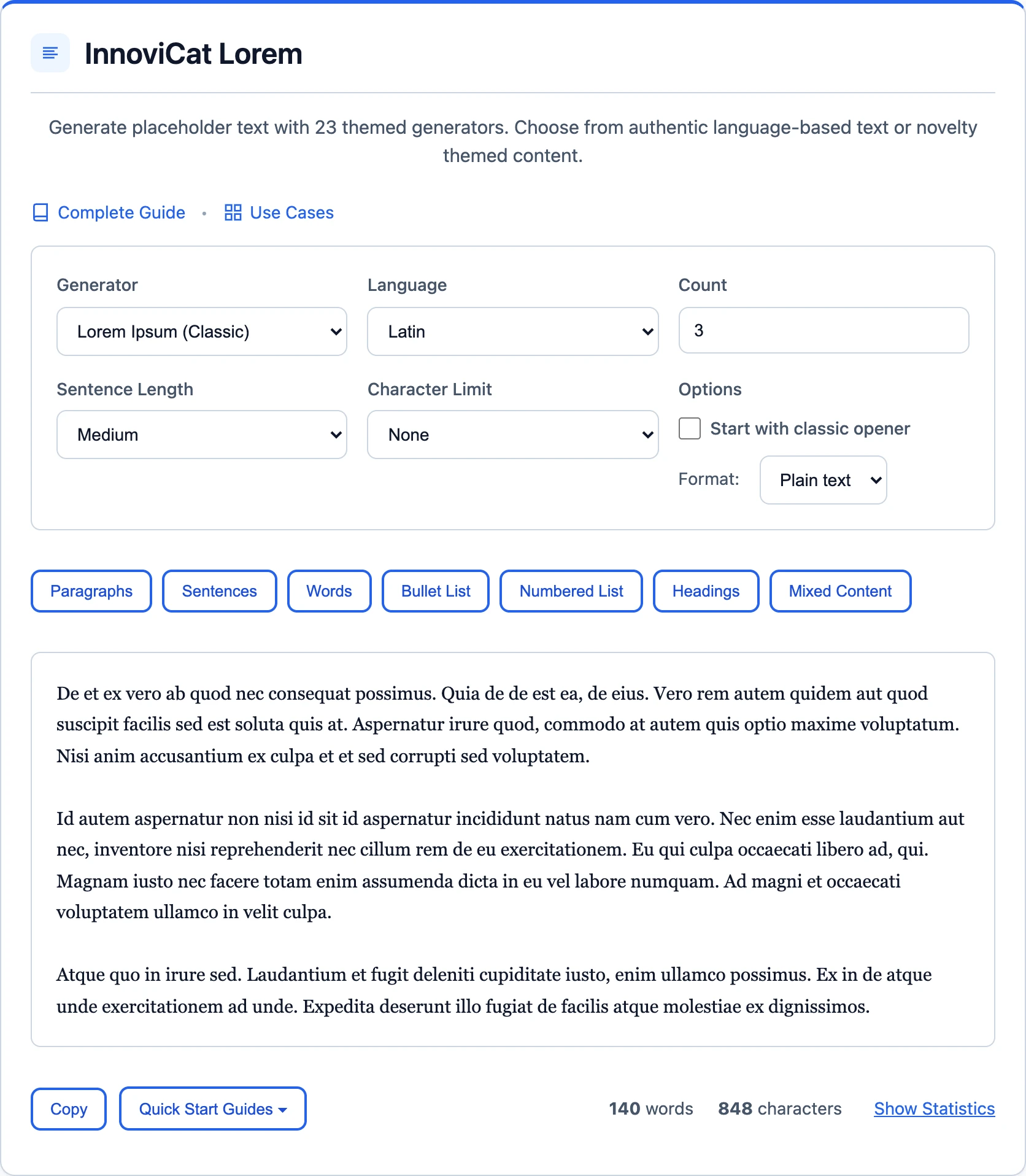
✓ Generate & Paste
Generate your text and paste it directly into your design tool.

Ready-to-Paste UI Text
Button Text
Card Description
Lorem ipsum dolor sit amet, consectetur adipiscing elit. Sed do eiusmod tempor incididunt.
Modal Content
Lorem ipsum dolor sit amet, consectetur adipiscing elit. Sed do eiusmod tempor incididunt ut labore et dolore magna aliqua. Ut enim ad minim veniam, quis nostrud exercitation ullamco laboris nisi ut aliquip ex ea commodo consequat.
Tooltip
Click here to learn more
Tips for UI Mockups
- Use Words output: For precise control, use Words output with exact counts.
- Test overflow: Generate both short and long text to test truncation.
- Consider localization: German text is often noticeably longer than English. Test with our German generator.
Frequently Asked Questions
How do I generate exact word counts for UI?
Use the Words output type and set the count to your exact needs (e.g., 3 for buttons, 20 for cards).
Which generator style is best for app mockups?
Classic Lorem Ipsum is most neutral. For specific industries, try themed generators like Corporate or Startup.