

Understanding Color Contrast
A comprehensive guide to WCAG guidelines and accessibility fundamentals
1. What is Color Contrast?
Color contrast measures the difference in perceived brightness (luminance) between two colors. It's expressed as a ratio from 1:1 (no contrast, like white on white) to 21:1 (maximum contrast, black on white). This ratio determines how easily text and UI elements can be distinguished from their backgrounds.
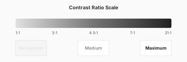
Unlike simple color difference, contrast ratio accounts for how the human eye perceives brightness. Two colors might look different but have similar luminance values, resulting in poor contrast. For example, saturated red (#FF0000) and saturated green (#00FF00) look distinctly different, but both have similar brightness, making them a poor combination for text readability.
2. Why Contrast Matters
Good color contrast is essential for accessibility and usability. It affects not just people with visual impairments, but everyone in various contexts. Poor contrast can make content completely unreadable for millions of users.
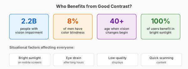
Who Benefits from Good Contrast:
- ~2.2 billion people globally have vision impairment (WHO, 2023)
- 8% of men and 0.5% of women have some form of color blindness
- Everyone experiences reduced contrast sensitivity in bright sunlight or low-light conditions
- Age-related vision changes affect nearly everyone over 40 (presbyopia)
3. WCAG Guidelines Explained
The Web Content Accessibility Guidelines (WCAG) are the international standard for web accessibility. WCAG 2.2 defines specific contrast ratios to ensure content is perceivable by people with moderately low vision or color deficiencies.
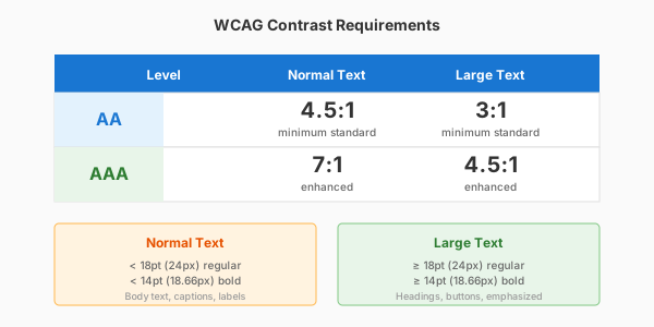
Level AA (Minimum Standard)
Level AA is the baseline for most organizations and is legally required in many countries. It requires 4.5:1 contrast for normal text and 3:1 for large text. This level accommodates users with 20/40 vision, the threshold for driving licenses in most countries.
Level AAA (Enhanced Accessibility)
Level AAA provides enhanced accessibility with 7:1 contrast for normal text and 4.5:1 for large text. This level is recommended for government websites, healthcare applications, and any content targeting older adults or users with visual impairments.
4. Text Size Categories
WCAG defines different contrast requirements based on text size because larger text is inherently easier to read. Understanding these thresholds is crucial for applying the correct standards.
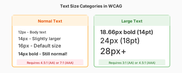
Normal Text
Normal text is defined as text smaller than 18pt (24px) or smaller than 14pt bold (approximately 18.66px bold). This includes body text, captions, form labels, and most interface text. Normal text requires the highest contrast ratios: 4.5:1 for AA and 7:1 for AAA.
Large Text
Large text is 18pt (24px) or larger, or 14pt (18.66px) bold or larger. This typically includes headings (h1-h3), buttons, and emphasized text. Large text has relaxed requirements because the increased size compensates for lower contrast: 3:1 for AA and 4.5:1 for AAA.
5. How Contrast is Calculated
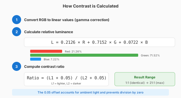
Understanding the contrast calculation helps you predict which color combinations will work. The process involves converting colors to luminance values and then comparing them.
Step 1: Convert to sRGB
Colors are first normalized to sRGB values between 0 and 1 by dividing each RGB component by 255. Then, gamma correction is applied to account for how displays render color. Values <= 0.03928 are divided by 12.92; larger values use the formula ((value + 0.055) / 1.055) ^ 2.4.
Step 2: Calculate Luminance
Luminance is calculated using weighted coefficients that reflect human eye sensitivity: L = 0.2126 × R + 0.7152 × G + 0.0722 × B. Note that green contributes most to perceived brightness (71.52%), while blue contributes least (7.22%). This is why pure blue text is harder to read than green.
Step 3: Compute Ratio
The contrast ratio is (L1 + 0.05) / (L2 + 0.05) where L1 is the lighter color's luminance and L2 is the darker color's luminance. The 0.05 offset prevents division by zero and accounts for ambient light. The result ranges from 1:1 (identical) to 21:1 (black and white).
6. UI Elements & Requirements
WCAG 2.2 introduced contrast requirements for user interface components and graphical objects, not just text. Different elements have different requirements based on their function and importance.

Text Content
All text must meet the contrast requirements based on size: 4.5:1 for normal text (AA) or 7:1 (AAA), and 3:1 for large text (AA) or 4.5:1 (AAA). This includes body text, headings, links, button labels, form labels, error messages, and placeholder text.
UI Components (WCAG 2.2)
Interactive elements require 3:1 contrast against adjacent colors. This includes form field borders, checkbox and radio button outlines, button boundaries, focus indicators, and any visual indicator that shows a component's state or boundary. Only the visual information required to identify the component needs to meet this threshold.
Icons & Graphics
Informational graphics require 3:1 contrast when they convey meaning not available through text. This includes icons that indicate status (warning, error, success), data visualizations, and infographics. Purely decorative graphics are exempt from these requirements.
7. Testing Your Colors
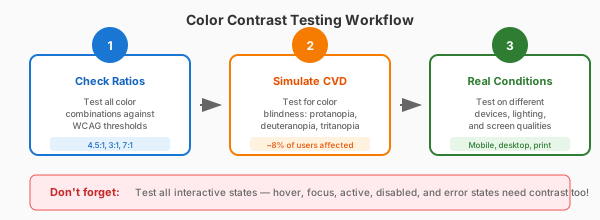
Effective contrast testing goes beyond just checking ratios. A systematic approach ensures your colors work for all users in all conditions.
Check Contrast Ratios
Use our contrast checker tool to verify your text and background combinations meet WCAG requirements. Test every color combination in your design, including hover states, focus states, disabled states, and error states.
Test for Color Blindness
Use our color blindness simulation feature to see how your design appears to users with protanopia, deuteranopia, and tritanopia. Ensure critical information isn't conveyed by color alone—add icons, patterns, or text labels.
Test in Real Conditions
View your design on different devices and in different lighting conditions. Test on both high-resolution and standard displays. Try viewing in bright sunlight and in dim rooms. Use your phone's accessibility features to test with grayscale mode enabled.
8. Best Practices
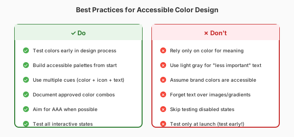
Following these best practices will help ensure your designs are accessible to the widest possible audience while maintaining visual appeal.
Do:
- Test colors early in the design process, not just before launch
- Build a color palette with accessibility in mind from the start
- Use multiple cues for important information (color + icon + text)
- Document your accessible color combinations for consistent use across your team
- Aim for AAA compliance when possible, especially for critical content
Don't:
- Rely solely on color to convey meaning (use icons, patterns, or text too)
- Use light gray text for "less important" content—it still needs to be readable
- Assume your brand colors are accessible—always verify
- Forget about text over images or gradients—test the lowest contrast areas
Ready to Check Your Colors?
Use our contrast checker to test your color combinations against WCAG guidelines, simulate color blindness, and get accessible alternatives.
Open Contrast Checker